
Introduction
ECan were aware that they had been internally focused for so long, they had lost sight of what their community really needed – and they asked us to help them change that around.
The re-designed site focuses on the user needs first, with the tools they use front and centre. We began by interviewing the key user groups and stakeholders to understand and analyse their goals, needs and pain points.
Community centric experience
The organisation had been internally focused for so long, they weren’t aware of what the community really needed. From a content management perspective, the key issue with the previous site was that it had become a dumping ground for each department.
It had become increasingly difficult to find current and correct information. This fuelled the negative perception held by the external audience that ECan was a government organisation that only cared about its own interests and not those of the people it serves.
A fresh take
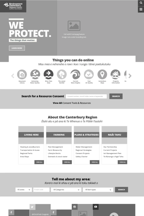
With its implementation of a new and improved information architecture and a streamlined, uncluttered interface, ECan has successfully achieved the optimal user experience. By reimagining its information structure, ECan has created a more intuitive and efficient platform for users to navigate, ensuring that relevant content is readily accessible.
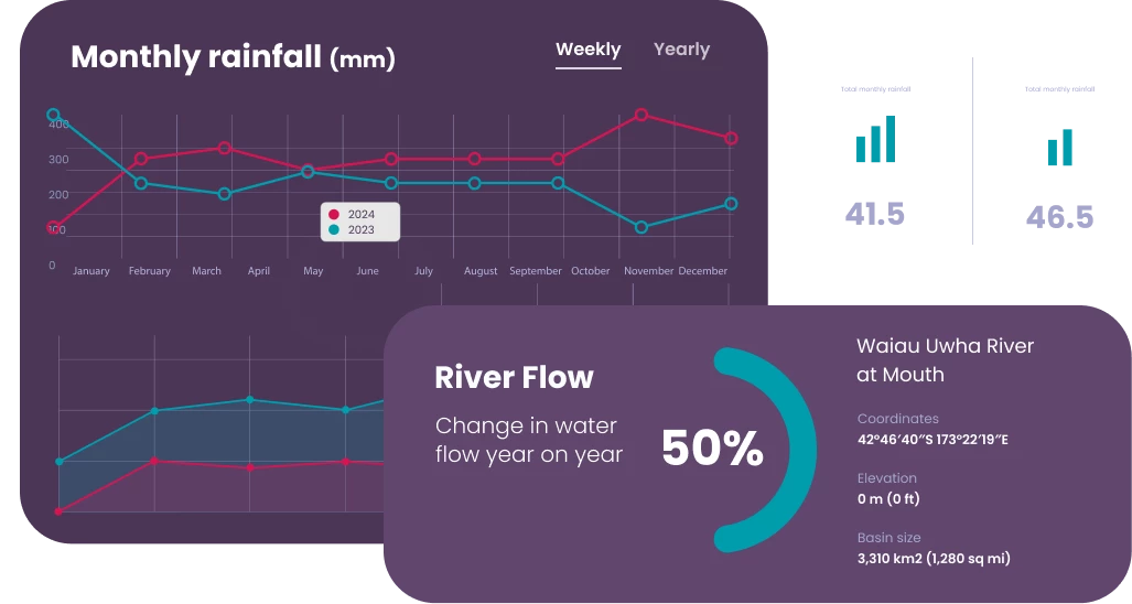
Data visualisation
To fulfill ECan's data visualization needs, we selected the versatile HighCharts library for its advanced features in JavaScript. Integrated seamlessly, HighCharts enhances interactivity and customization across various ECan solutions, ensuring dynamic and tailored data presentation for stakeholders.
What we did
Pikselin scripted and conducted interview sessions to gain important insights early with helped define the digital vision and strategy. We effectively and quickly gained key insights like personas, goals, target audience, and approach.
We collaborated closely with stakeholders to define an initial IA draft, which served as a foundation for further refinement. Through iterative discussions and feedback, we honed the IA to ensure it effectively organized content and met the needs of both the business and users.
Tree testing is a usability technique used to evaluate the findability of topics in a website's information architecture. Participants were asked to locate specific items within a simulated hierarchy, providing insights into the effectiveness of the navigation and labelling.
Dynamic wireframes that blend static elements with interactive features, enriched with detailed annotations. These wireframes serve as a blueprint for web and app development, enhancing communication and clarity in design.
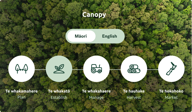
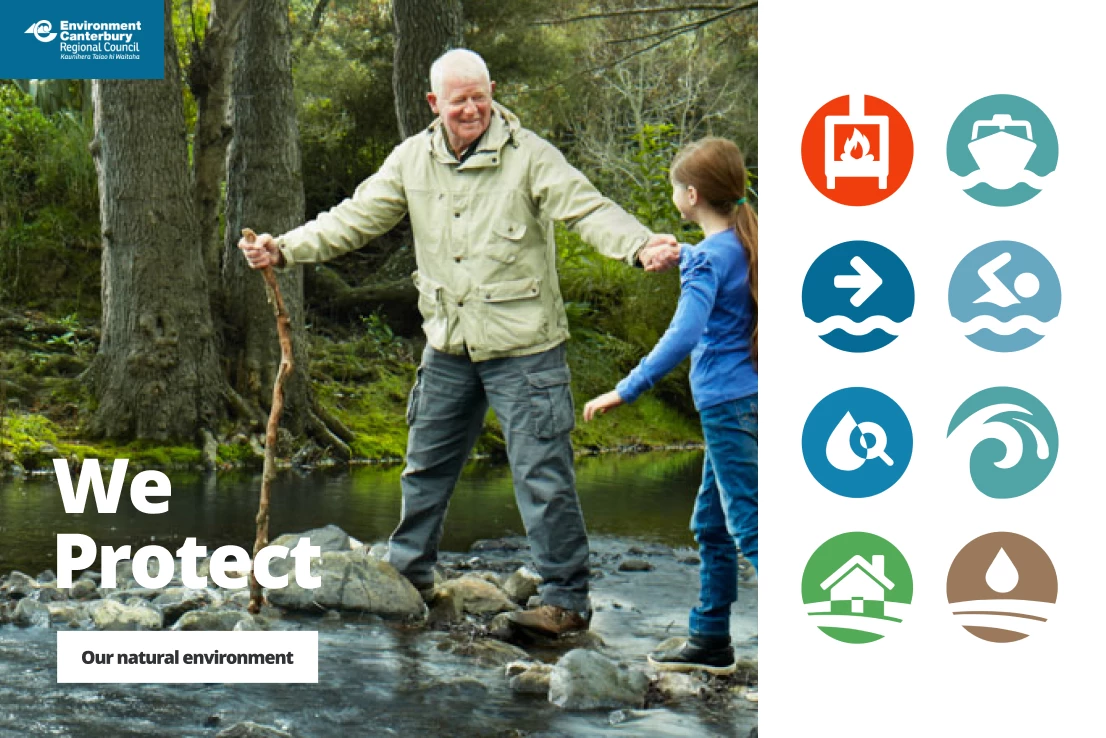
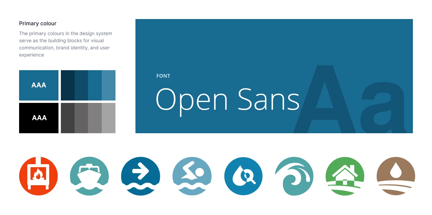
Crafting digital brand identities that resonate, paired with intuitive user interfaces that captivate. Our designs are not only visually compelling but also functionally accessible and responsive, incorporating iconography, infographics, and bespoke illustrations to enhance user experiences.
Utilising proven front-end development tools, we constructed the website, transforming the visual design into meticulously crafted, web-ready code optimised with the latest techniques and standards.
We utilised SilverStripe as the CMS for the website, while creating and optimising the modules, and extensions to meet specific project needs.
We tested accessibility to ensure the website is usable by people with disabilities, following standards like WCAG. The report identified any gaps and fixes needed to ensure an optimal inclusive web experience.